
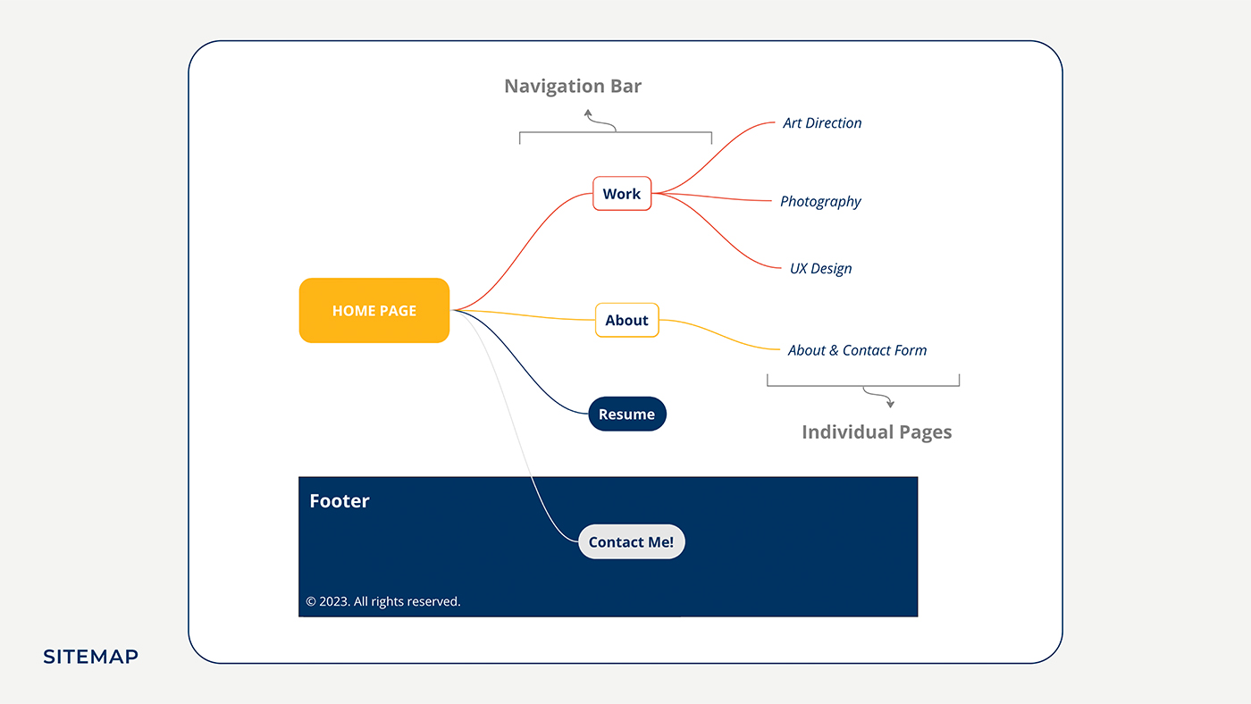
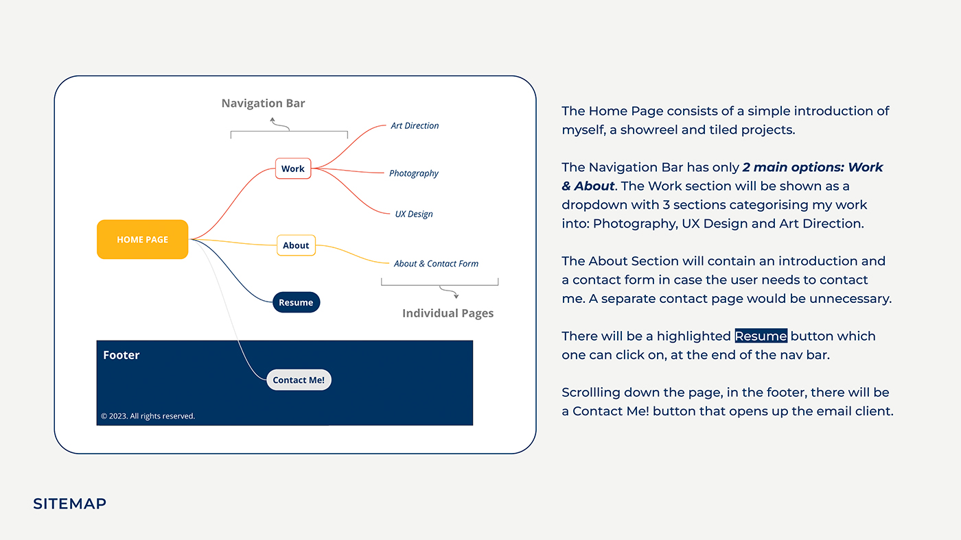
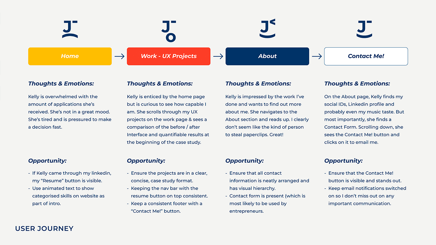
Portfolio Website
An assignment that started in UX Design class as a prototype and was eventually coded during Web Development class during my studies at Algonquin College. I was able to rebrand myself as a creative professional, focus on potential clients and tech recruiters, while portraying my work and identity through the website.
Concept & Mood board:
Keywords:
Conducting User Research with friends I'd asked to describe me, I received the following words:
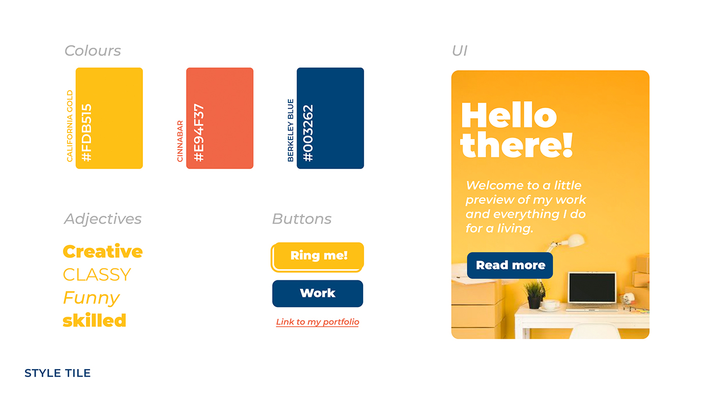
Colours:
Bucketing these words into 3 main keywords: Creative, Friendly & Hard-Working, I derived colours for them and chose a palette that reflects my personality and work ethic:
KEYWORD: CREATIVE
California Gold
A vibrant, energetic hue symbolizing innovation, imagination, and confidence. It reflects the boldness and optimism of my creative problem-solving.
KEYWORD: FRIENDLY
Cinnabar
A warm, inviting shade that conveys my approachability, enthusiasm, and connection. It reflects care, respect, and my ability to build positive relationships.
KEYWORD: HARD-WORKING
Berkeley Blue
A deep, reliable blue representing my professionalism, perseverance, and focus. It reflects trustworthiness, a commitment to mastery, and a dedication to quality work.
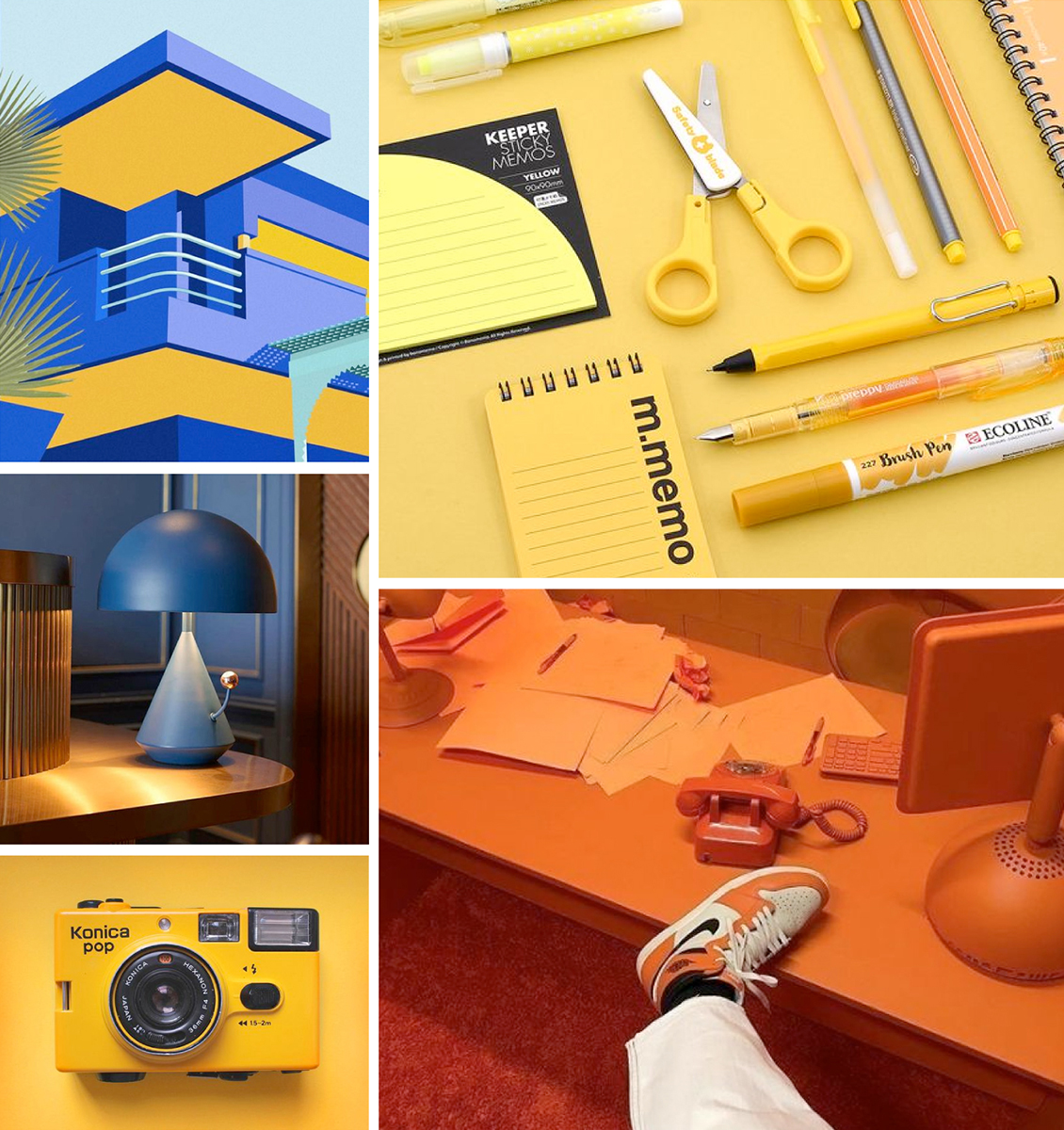
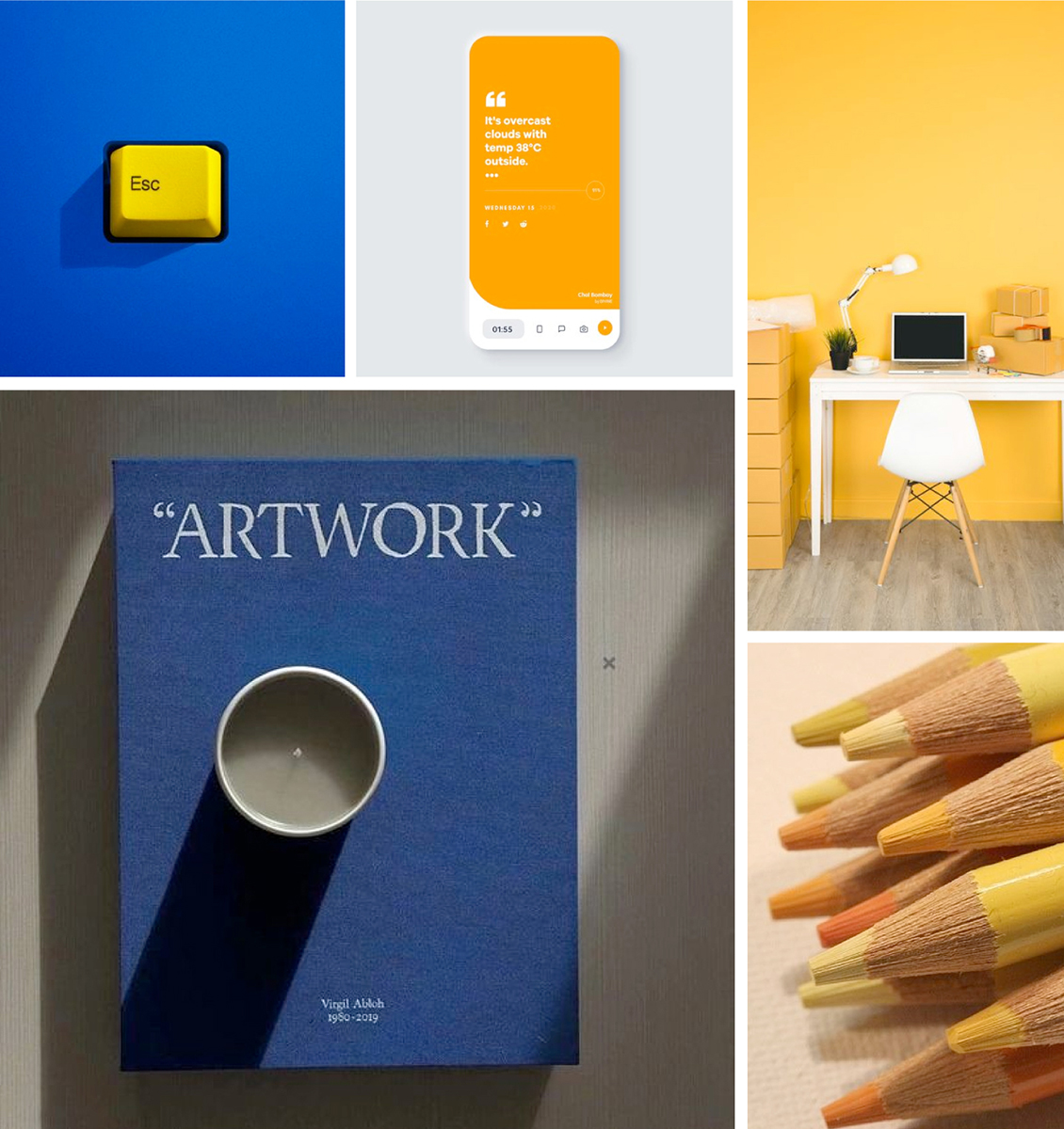
Imagery:
Style Tile:


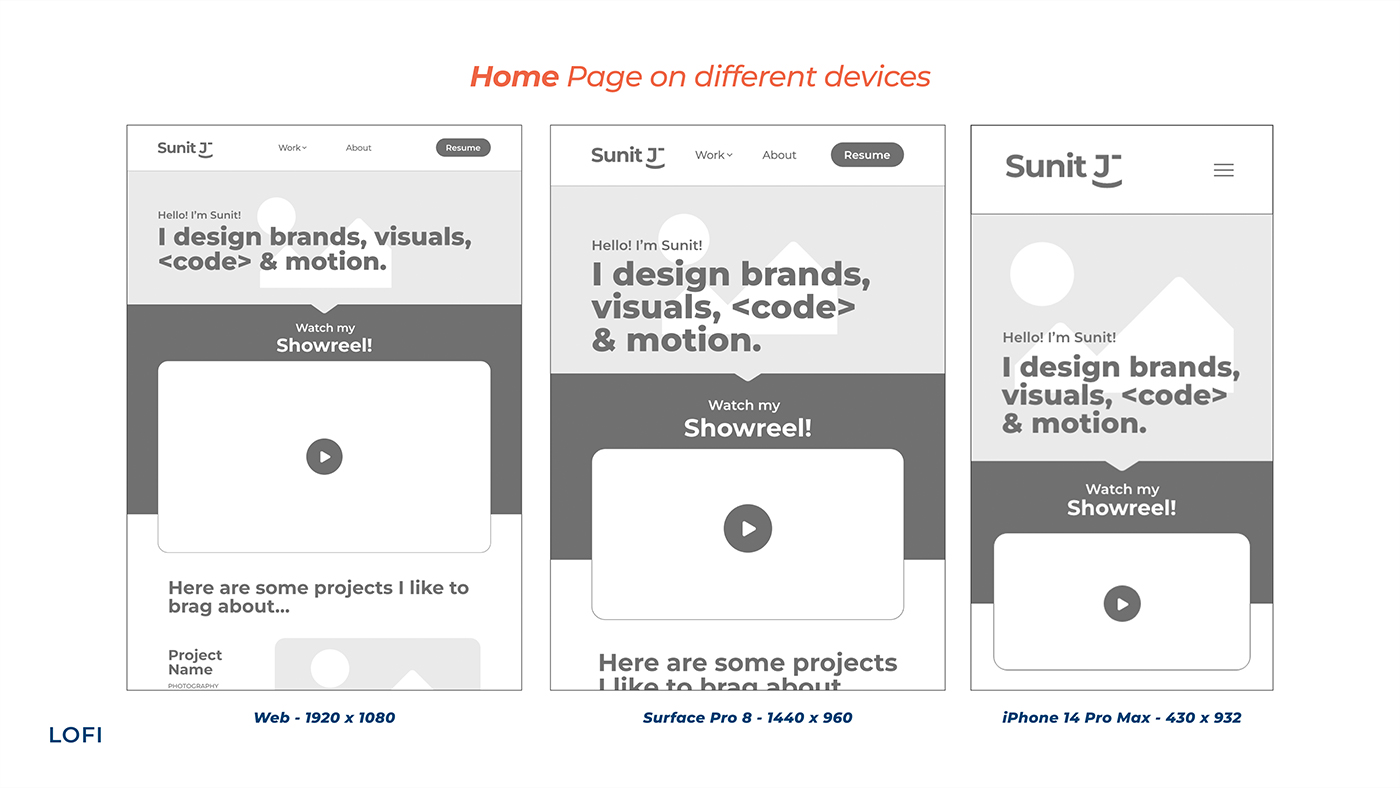
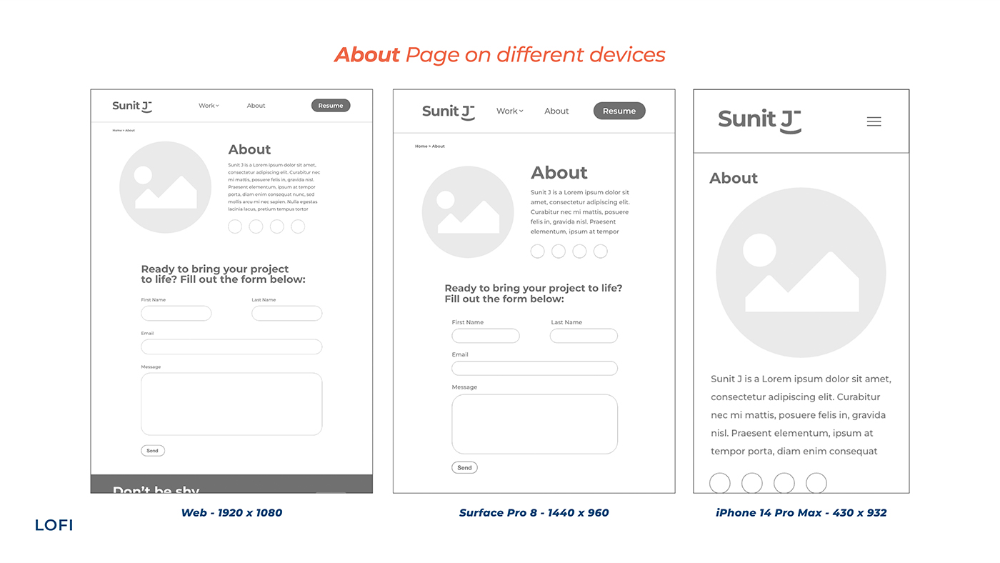
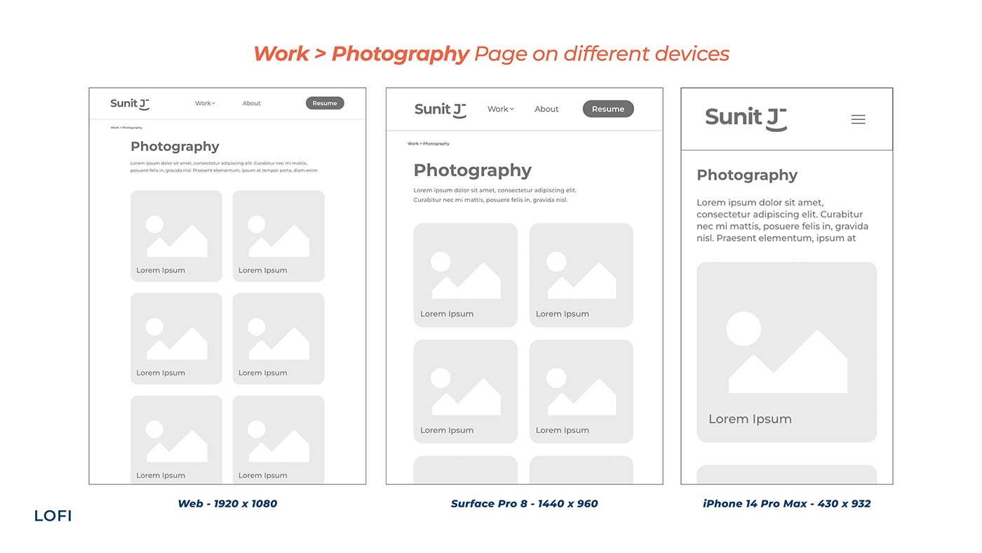
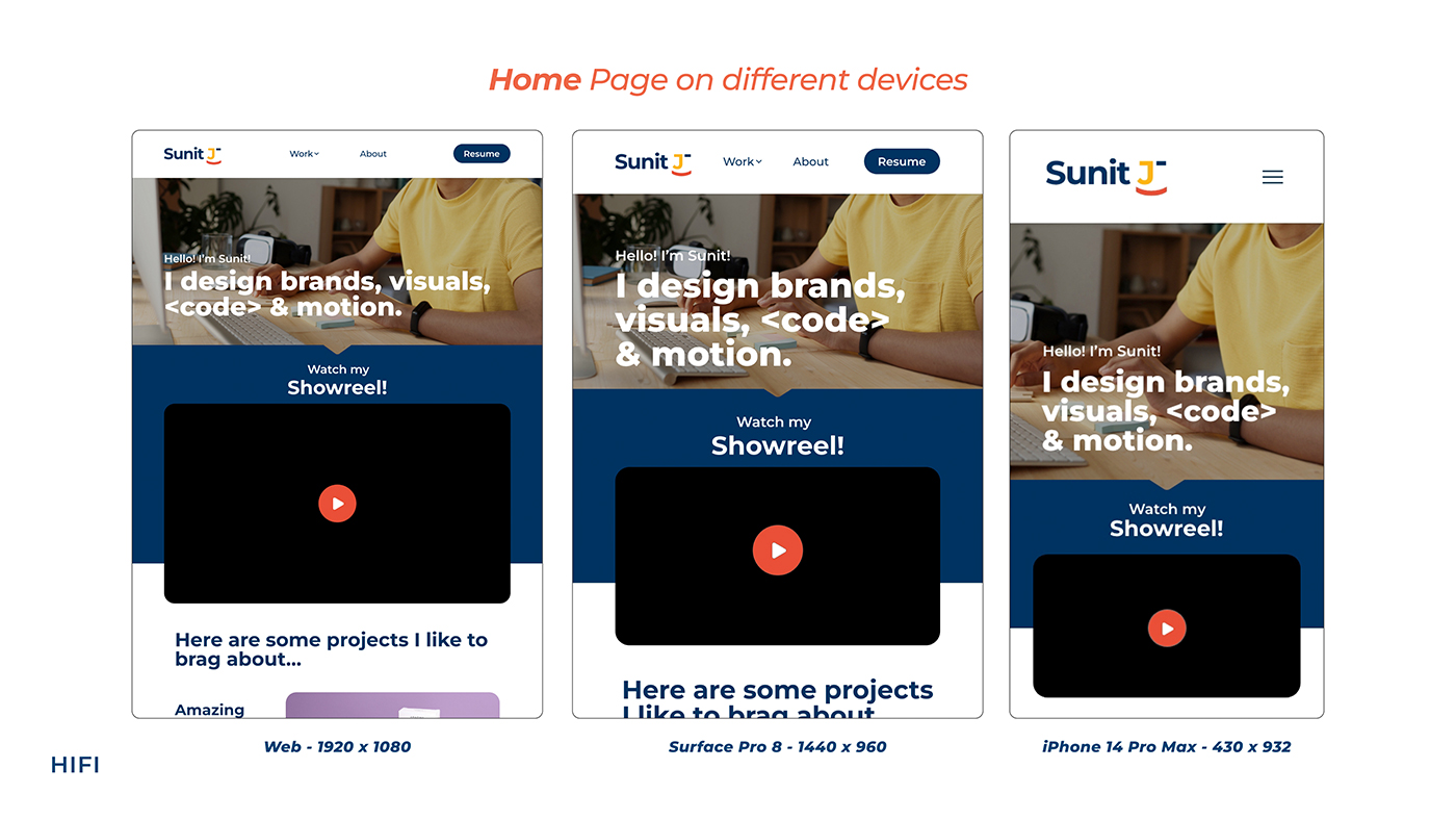
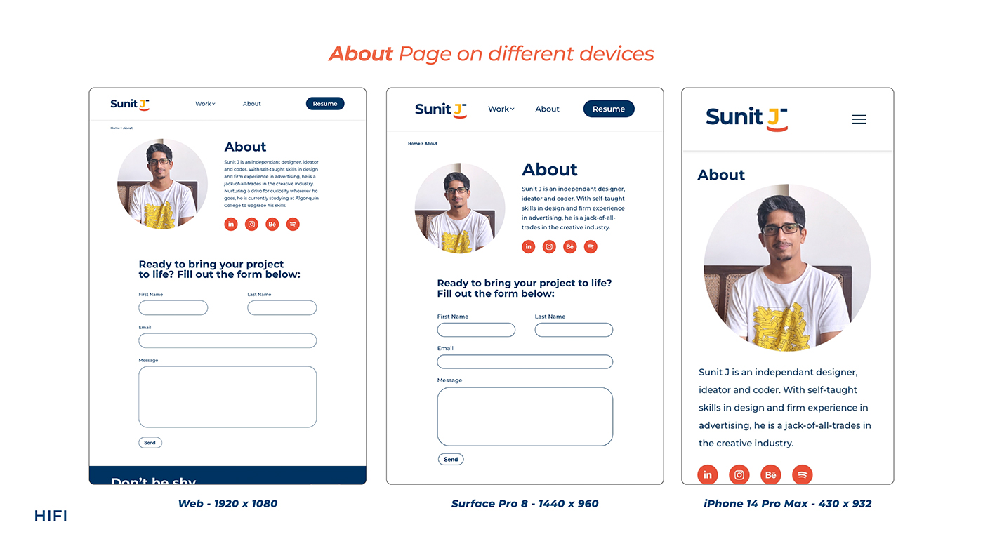
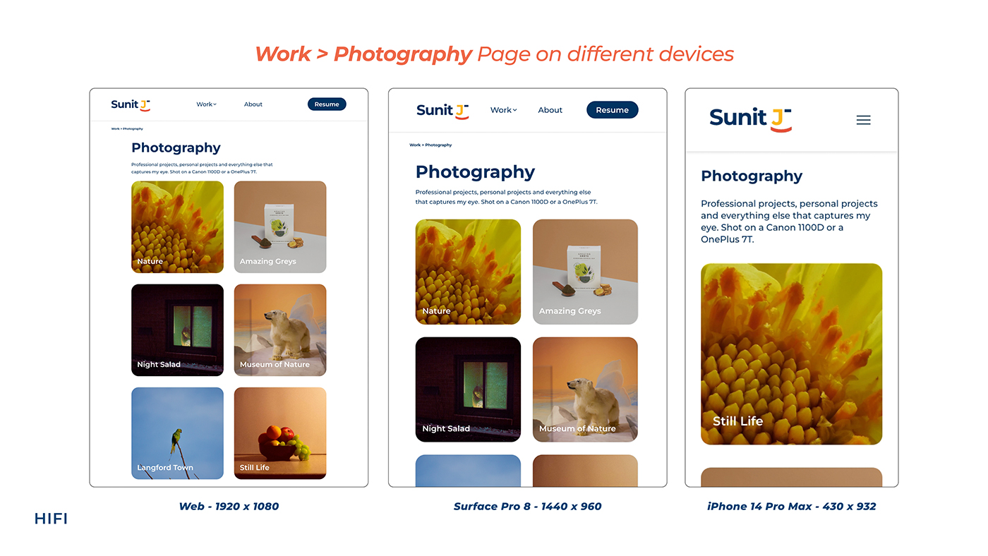
The final product is the website
you’re browsing on. I'm always
making changes and upgrades to it, but click around to see how this project has evolved!
Want to compare? Click here for version 1.0
Thank you for scrolling till the end.